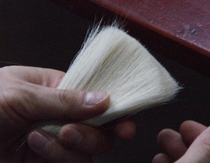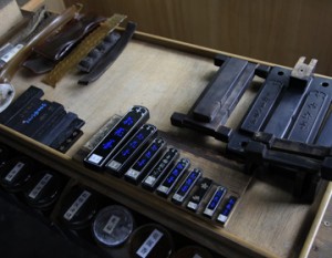

What calligraphy conveys.
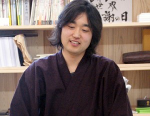
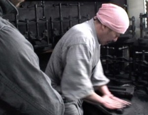
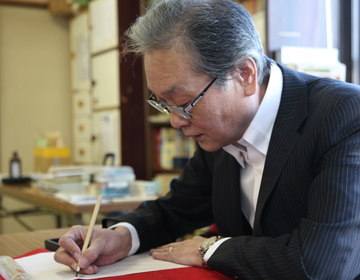
Shiro Saeki serves as a documentation specialist in the Imperial Household Agency, and is the Emperor’s ”yuhitsu”. That means, he hand-writes the words and letters of the Emperor and the Empress on their behalf. He has received many honors and awards, teaches at a college, and is at the forefront of the world of calligraphy.
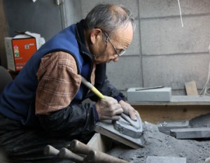
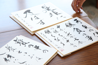
Needless to say, his calligraphy works are splendid. However, he says that ”As long as the characters are the medium, I think anything can become works of calligraphy.” He showed me a piece of work that depicts the image of aurora, which the letters ”kyokkou” (aurora) are written in colorful paints. It is more like a painting than a work of calligraphy, being colored and some designs are drawn. Looking at the letters ”kyokkou” alone cannot convey such an expansion of images. It may seem unconventional, but this is also a work of calligraphy, said Saeki.
Alphabets in oriental calligraphy.
”I want the young people to know that calligraphy doesn’t have to be so formal.” From this idea, he writes the lyrics of pop songs, too.
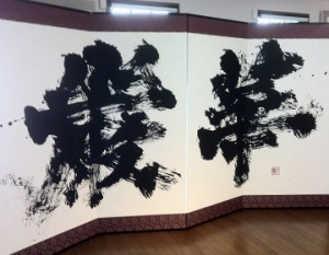
”There are English words in the lyrics, aren’t there?”, asks Nakata. An obvious question. Saheki writes the alphabets in the style of oriental calligraphy, and vertically, too, but it does not seem odd at all.
”There is a letter ”inochi”, for example, but it looks like as if it is composed of letters A, O, P, you see.” Very convincing.
How to write good handwriting.
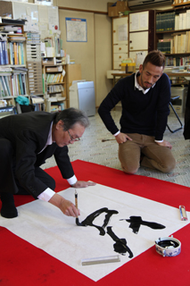
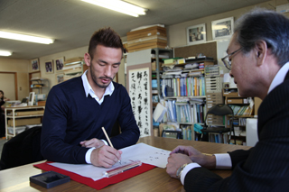
After seeing Saheki’s works, Nakata was given a lesson to write his name with a calligraphy brush. According to Saeki, writing Hidetoshi Nakata is not easy.
”Nakata doesn’t have many lines, but Hidetoshi has many lines, so it not easy to get a good balance.”
Saeki says the No. 1 secret of good handwriting is balance. If you write the letters one by one, you cannot have good balance, so it is important to look at the characters ”Hidetoshi Nakata” as a whole.
The second secret is to make the vertical lines thick and horizontal lines thin. Generally, ”kanji” has more horizontal lines than vertical, so to make a good balance, vertical lines should be thicker. Also, it looks better when the right half of the ”kanji” is written thicker than the left.
With this advice, Nakata wrote his name. He was satisfied with the result. Nakata, who has many opportunities to write his name, said, ”Now I can write my name with confidence.”